Published
- 1 min read
Prototyping project: Patient Data
Prototyping project: Patient Data’
The Challenge
How do you make AI-powered health data understandable?Exploration: Three Visual Directions
I started by exploring how different visual styles serve different contexts:
Clean Medical. Clinical - for conservative healthcare clients

Direction B: Dark theme. Bold & Innovative - for executive presentations

Direction C: Minimal. Clear & Sophisticated - for strategy consulting (Selected this one)

Why Direction C? It aligns with Scandinavian positioning and puts focus on insights, not decoration. Design decisions driven by audience needs, not aesthetics.
Making AI Insights Tangible
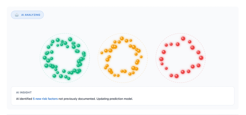
Next, I prototyped animations that show AI discovering patterns in real-time.
Patients organize themselves into risk groups. The AI discovers:

3 distinct clusters with shared risk factors 65% correlation between age and condition severity High-risk concentration in specific demographics
Alternative visualization showing patient relationships and connections:
Population-level view identifying “hot zones” for resource allocation:

Possible next steps
- React + TypeScript for production-ready code
- Canvas API for smooth 60fps animations
- Physics simulations for natural movement
- Ready to integrate with real AI/data sources